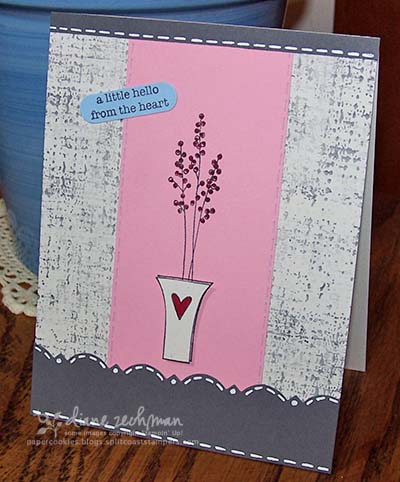
 This is such a cute set…can you believe I finally mounted it? I am anxious to use it some more. I love the versatility it has! I haven’t used my Basic Gray paper in a while either so I pulled that out as well. And pink just goes so well with gray. 😉 I keep thinking that it needs a band of ribbon around the bottom piece of gray….what do you think? I also like the simplicity of it though so I may leave it as is. The gray piece was punched with the Martha Stewart Cornice Edge punch. And the vase was stamped a second time and popped up on dimensionals. The background was made with the SU! Rough Texture wheel. I wheeled it in both directions.
stamps- Vases in Vogue, Rough Texture wheel
paper- Basic Gray, Pretty in Pink, Bashful, non-SU
ink- Basic Gray, Rose Red
accessories- Martha Stewart Cornice Edge punch, pop dots, gel pen
 cookiestamper ♥


3 responses to “Vases in Vogue”